SaaS Onboarding Flow Design: The 2026 Activation Playbook
12 MIN
October 17, 2025
Abhishek Doshi
Directing Manager
In this article
Share
SaaS Onboarding Flow Design in 2026 is won by execution quality, not platform hype. Teams that perform consistently align strategy, implementation, and measurement into one operating system. This guide gives the practical framework, internal link map, and optimization cadence to do that.Onboarding decides retention. Here's the flow design that takes SaaS trial-to-paid from 12 to 22 percent. If you want implementation help, work with product design team. For connected strategy, also review Saas UI UX Design Principles and Saas Website Growth Strategy.
What SaaS Onboarding Flow Design Means in Practice
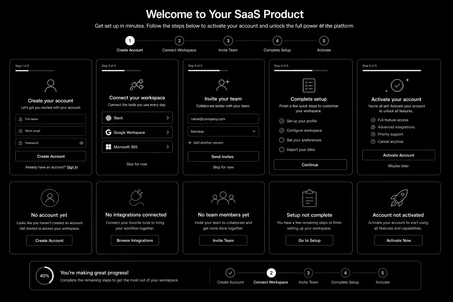
SaaS onboarding flow design drives activation and retention by guiding users to first value quickly. The strongest flows use milestone logic, contextual guidance, and recovery paths for stalled users.
Why saas onboarding flow Matters in 2026
1. Activation efficiency now strongly affects CAC payback.2. Users reject long generic onboarding tours.3. Milestone completion predicts retention better than vanity engagement metrics.
Step-by-Step Playbook
1. Define activation milestone
Set one clear event that predicts long-term value.
2. Map first-session friction
Identify where users stall before activation.
3. Design progressive guidance
Trigger contextual support based on user state.
4. Create recovery paths
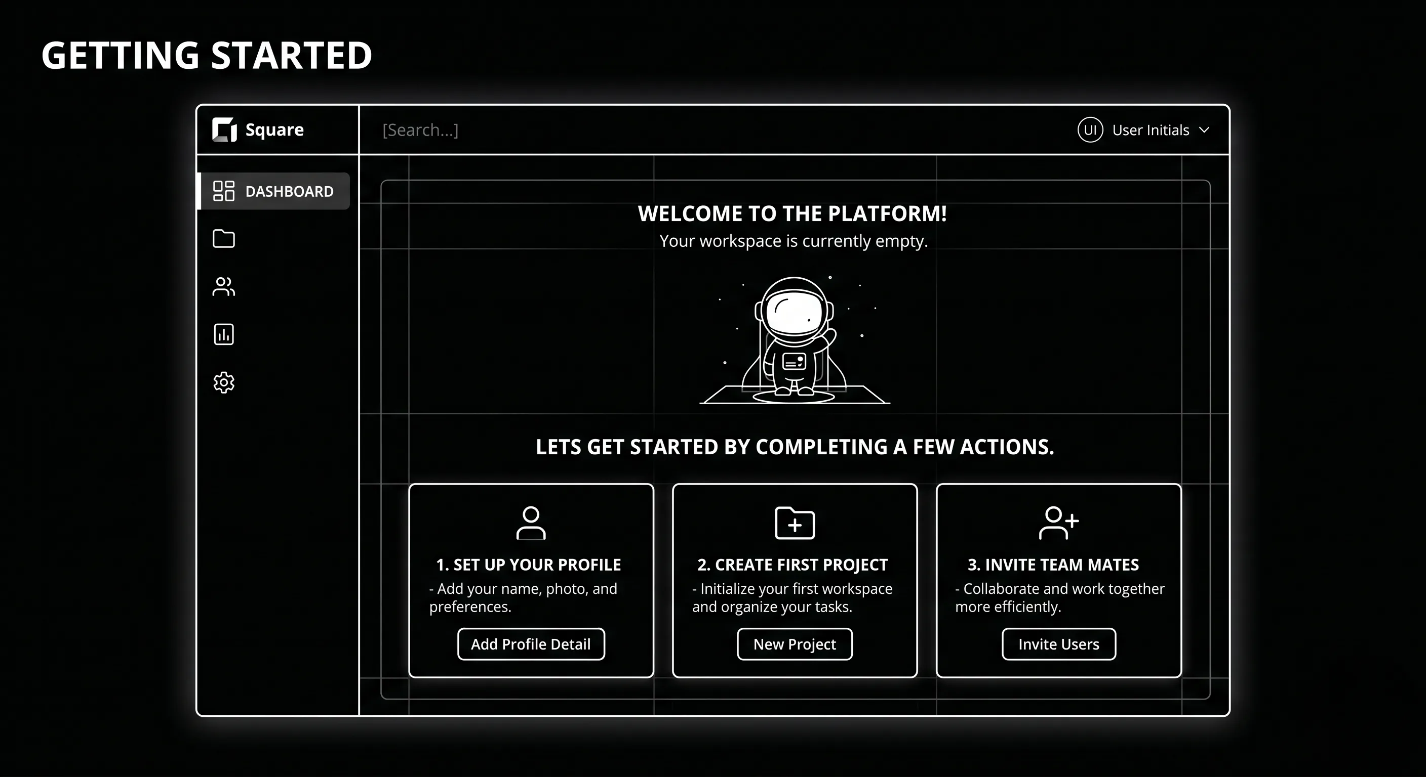
Use empty states and reactivation nudges for stuck users.
5. Track cohorts weekly
Monitor milestone completion and improve weakest steps.Mid-article CTA -> Need support applying this to your stack? Onboarding UX audit and get a scoped roadmap with timeline, owners, and KPI targets.
How long does a saas onboarding flow project usually take?
Most teams can ship an initial version in 4 to 8 weeks, then improve outcomes over one quarter with a weekly optimization cadence.
Is saas onboarding flow relevant for UK and US teams?
Yes. The core framework is consistent across both markets. Differences are usually compliance details, buying behavior, and GBP/USD planning.
What should we measure first for saas onboarding flow?
Track one leading metric, one conversion metric, and one revenue metric so execution stays tied to business impact.
Should we run this in-house or with a specialist partner?
If your team has deep expertise and bandwidth, in-house can work. If speed and risk control matter, working with a specialist partner is usually faster.
What is the most common failure mode?
Teams skip governance after launch. Data quality drifts, process quality declines, and performance plateaus. A simple weekly operating rhythm prevents this.
Conclusion
SaaS Onboarding Flow Design performs best when execution decisions are tied to measurable outcomes from day one. Use this playbook to prioritize what matters, reduce risk, and create a repeatable optimization rhythm.Want a specialist team to accelerate delivery? Talk to product design team or book a consultation and we will map a practical rollout plan.Download the SaaS Onboarding Activation Map to implement this framework with templates and checklists.
The SaaS Onboarding Activation Toolkit — activation milestone worksheet, user journey mapping template, onboarding friction audit, progressive onboarding framework, recovery flow planner, experiment tracker, and cohort KPI dashboard to design onboarding experiences that increase activation, retention, and trial-to-paid conversions.
Mobile UX for Ecommerce: Convert the 70% Browsing on Phones
Mobile UX for Ecommerce: Convert the 70% Browsing on Phones
Mobile UX for Ecommerce in 2026 is won by execution quality, not platform hype. Teams that perform consistently align strategy, implementation, and measurement into one operating system. This guide gives the practical framework, internal link map, and optimization cadence to do that.Mobile drives traffic and desktop drives conversion — for brands that haven't fixed mobile UX. Here's the 2026 fix. If you want implementation help, work with our UI/UX team. For connected strategy, also review Shopify Conversion Rate Optimization and Website Redesign Guide. You can also align execution with Shopify development for cross-functional delivery.
What Mobile UX for Ecommerce Means in Practice
Mobile UX for ecommerce is now core conversion work because most sessions start on phones. The biggest gains come from reducing thumb-friction and simplifying high-intent actions.
Why mobile conversion optimization Matters in 2026
1. Traffic is mobile-heavy but many stores are still desktop-first.2. Checkout leakage on mobile often comes from interaction friction.3. Small UX fixes can produce meaningful revenue impact.
Step-by-Step Playbook
1. Audit mobile funnel leakage
Track PDP-cart-checkout drop-off by device cohort.
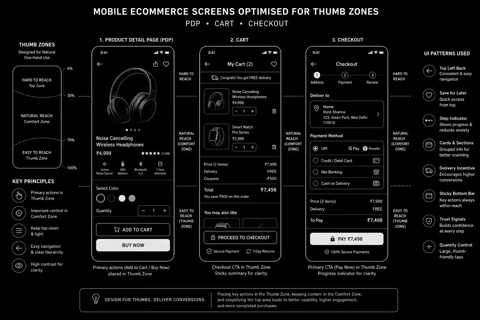
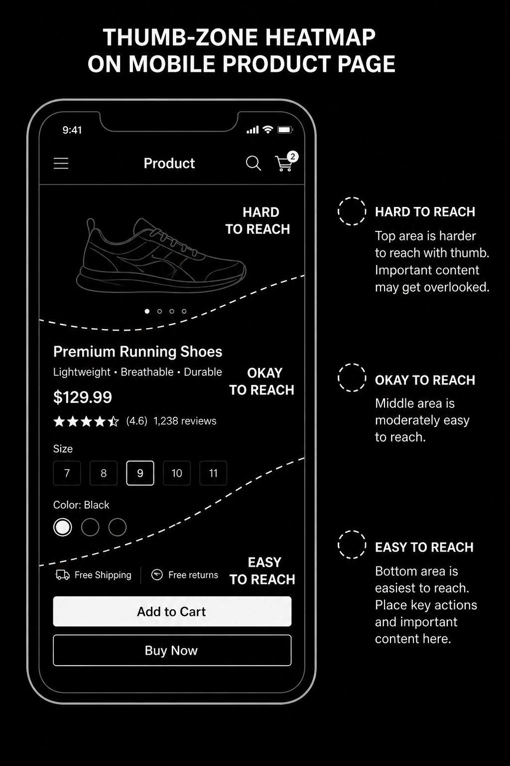
2. Redesign for thumb zones
Move key actions into reachable areas and simplify taps.
3. Shorten form burden
Use autofill, clearer labels, and lighter validation friction.
4. Add trust cues where users hesitate
Place shipping, returns, and proof near decision points.
5. Test focused changes
Run one-friction-point experiments with clear success criteria.Mid-article CTA -> Need support applying this to your stack? Mobile UX audit and get a scoped roadmap with timeline, owners, and KPI targets.
Tools, References, and Benchmarks
Mobile funnel map
Thumb-zone UI checklist
Checkout friction QA sheet
Semantic keyword targets to distribute naturally: mobile cro, mobile checkout optimization, mobile commerce ux
How long does a mobile conversion optimization project usually take?
Most teams can ship an initial version in 4 to 8 weeks, then improve outcomes over one quarter with a weekly optimization cadence.
Is mobile conversion optimization relevant for UK and US teams?
Yes. The core framework is consistent across both markets. Differences are usually compliance details, buying behavior, and GBP/USD planning.
What should we measure first for mobile conversion optimization?
Track one leading metric, one conversion metric, and one revenue metric so execution stays tied to business impact.
Should we run this in-house or with a specialist partner?
If your team has deep expertise and bandwidth, in-house can work. If speed and risk control matter, working with a specialist partner is usually faster.
What is the most common failure mode?
Teams skip governance after launch. Data quality drifts, process quality declines, and performance plateaus. A simple weekly operating rhythm prevents this.
Conclusion
Mobile UX for Ecommerce performs best when execution decisions are tied to measurable outcomes from day one. Use this playbook to prioritize what matters, reduce risk, and create a repeatable optimization rhythm.Want a specialist team to accelerate delivery? Talk to our UI/UX team or book a consultation and we will map a practical rollout plan.Download the Mobile Ecommerce UX Audit to implement this framework with templates and checklists.
Mobile Ecommerce UX Audit Toolkit — A complete optimization resource with mobile UX audit checklists, thumb-zone guides, checkout optimization templates, CRO scorecards, KPI dashboards, and testing frameworks to improve mobile conversions and increase ecommerce revenue.
UI/UX Design for B2B Websites: What Converts Decision Makers
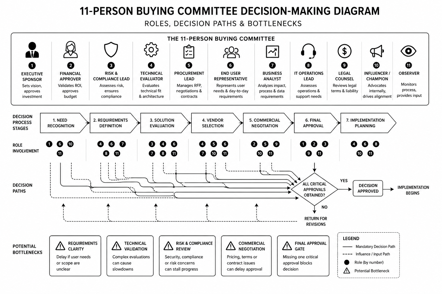
B2B websites fail because they're designed for individual buyers. But B2B purchases aren't individual. They're committees. 11 people reviewing the decision. Finance, procurement, operations, security, and business buyers all asking different questions.This guide covers UX patterns that address a committee, not a person. Trust signals that matter in longer sales cycles. Page layouts that answer 11 different questions on one page. Practical patterns for B2B sites that actually move enterprise deals.
B2B Decision-Making: The UX Reality
The buyer who lands on your site is rarely the decider. They're the initiator. Five other people will review before a buying decision happens. Your site has to answer questions for:
Business buyer: "Does this solve our problem and improve metrics?"
Finance: "Is this within budget and what's the ROI?"
Procurement: "What's the contract, SLA, and support?"
Operations/IT: "Can we integrate this? How much work?"
Security: "Is this secure? Compliant? Who has access?"
Your UX has to make all five questions answerable in 5 minutes, not buried in docs.
The B2B UX Patterns That Convert
1. Hero section shows business outcome, not feature list. "Reduce customer churn by 25%" beats "AI-powered churn prevention." Every enterprise buyer answers: "Does this help our metrics?"2. Below hero: immediate proof of viability. Security badges (SOC 2, ISO 27001), compliance (HIPAA, GDPR), certifications visible within first viewport. Security buyers check this before they scroll.3. "Featured customers" section with logos + specific results. Not "Trusted by 500+." Show: "Acme Corp (Fortune 500) reduced churn 30%." Names and metrics matter more than volume.4. Integration/compatibility section explaining "how it fits." "Works with: Salesforce, HubSpot, Marketo..." Operations teams evaluate this early. Make it obvious, not buried.5. Case study section with quantified results per role. One case study told three ways: "Business impact: +40% conversion." "IT impact: 2-hour integration." "Finance impact: ROI in 6 months." Different stakeholders read different sections.6. Transparent pricing (or honest "let's talk pricing"). Enterprise usually requires custom contracts, but show a starting price or clear explanation. Hidden pricing kills trust with procurement.7. FAQ section answers implementation questions. Not generic "how do I sign up?" but "What's the typical implementation timeline?" "Can I cancel anytime?" "What training is included?" Real concerns.8. Contract and security documentation linked (not hidden). SOC 2 report, DPA, standard contract visible. Security teams will find these anyway. Hiding them signals something's wrong.9. Reference customer section with names/LinkedIn profiles. "Ask me how" buttons with contact info. Finance and procurement want to call existing customers. Make this easy.10. Implementation timeline explicit and realistic. "Go-live in 2 weeks for core product, 6 weeks fully integrated with your stack." Operations buyers need to know the work window.
Trust Signals That Matter in B2B
B2B buyers have different trust criteria than consumers:
Verified certifications (SOC 2, ISO 27001) beat "we're secure."
Named reference customers beat "trusted by enterprises."
Case studies with named customers beat anonymized results.
Documented SLAs and support terms beat vague "24/7 support."
Team bios with credentials beat faceless company names.
Published roadmap beats "coming soon" features.
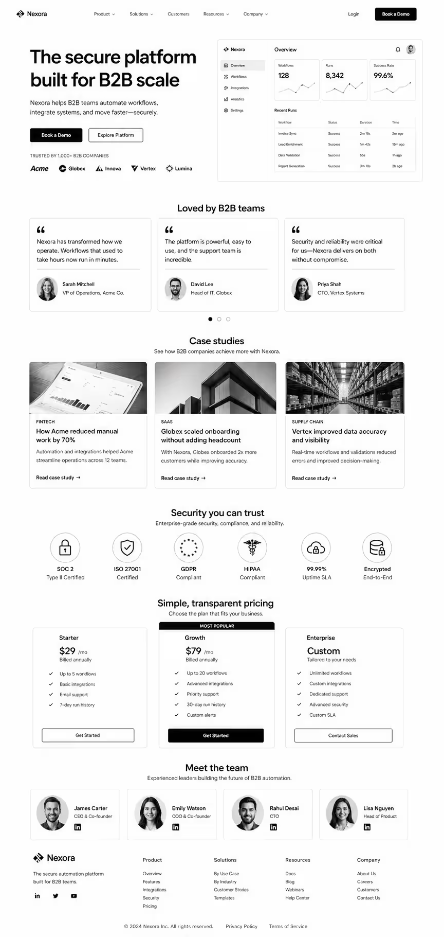
Layout Pattern That Answers All 11 Questions
Section order that works:
Hero + value prop
Trust/security badges
Named customer logos + results
Use case / vertical segmentation
Feature overview (linked to implementation docs)
Integration/compatibility
Case studies (told multiple ways)
Pricing (transparent or clear process)
FAQ section (implementation, security, support)
Security/compliance documentation links
Reference customer contact options
CTA section (demo + sales contact)
This pattern isn't consumer-friendly or short-form. It's 4,000+ words. B2B sites longer than 2,000 words often convert better than short sites.
Redesigning your B2B website and want expert guidance on conversion design? Our design team specialises in B2B. Book a discovery call.
FAQ
Should my B2B site be long or short?
Long. Enterprise buyers need comprehensive information. 3,000–5,000 words is standard. Short sites under 1,000 words usually leave money on the table.
Can I use consumer design patterns for B2B?
No. Minimalist, short-copy, high-image websites work for B2C. B2B buyers need comprehensive information architecture and trust signals. Different discipline entirely.
How do I know what questions our buying committee is asking?
Talk to 5 customers who bought and 5 who didn't. Ask each role (finance, IT, procurement) what convinced or didn't convince them. Design for those specific questions.
Should I hire a B2B UX specialist?
If your B2B website is a growth engine, yes. B2B UX is a specialist discipline. Generalist designers often miss the committee buying pattern.
How do I measure B2B website success?
Demo requests (not pageviews). Average sales cycle time (shorter is better). Lead quality score (fewer disqualified early). Website-sourced revenue (not leads, actual closed deals).
Conclusion: B2B UX Solves for Committees, Not Consumers
The best B2B websites aren't the prettiest. They're the most comprehensive. They answer 11 different questions on the same page. They build trust through transparency, not hype. They make reference calls easy and security documentation obvious.Design for your committee, not your persona. You'll convert more enterprise deals.Our B2B UX team redesigns enterprise websites for SaaS and B2B brands. Book a consultation if you want expert eyes on your current site.
The B2B UX Pattern Library — templates for each pattern mentioned above, ready to adapt for your product.
SaaS UI/UX Design: Principles That Convert in 2026
Most SaaS UI/UX design articles confuse aesthetics with UX. A clean interface with good spacing isn't UX. UX is whether a user activates in 10 minutes or 10 days. Whether they expand into a seat-based plan or churn at month 4. Whether they invite their team without being asked.This guide is for founders, heads of product, and design leads who need their SaaS product to do the heavy lifting in a market where sales cycles are longer, buyers are more skeptical, and every trial is one bad onboarding away from a cancelled credit card. These are the 2026 UX principles that move activation, retention, and expansion — not Dribbble screenshots.
What SaaS UX Actually Is
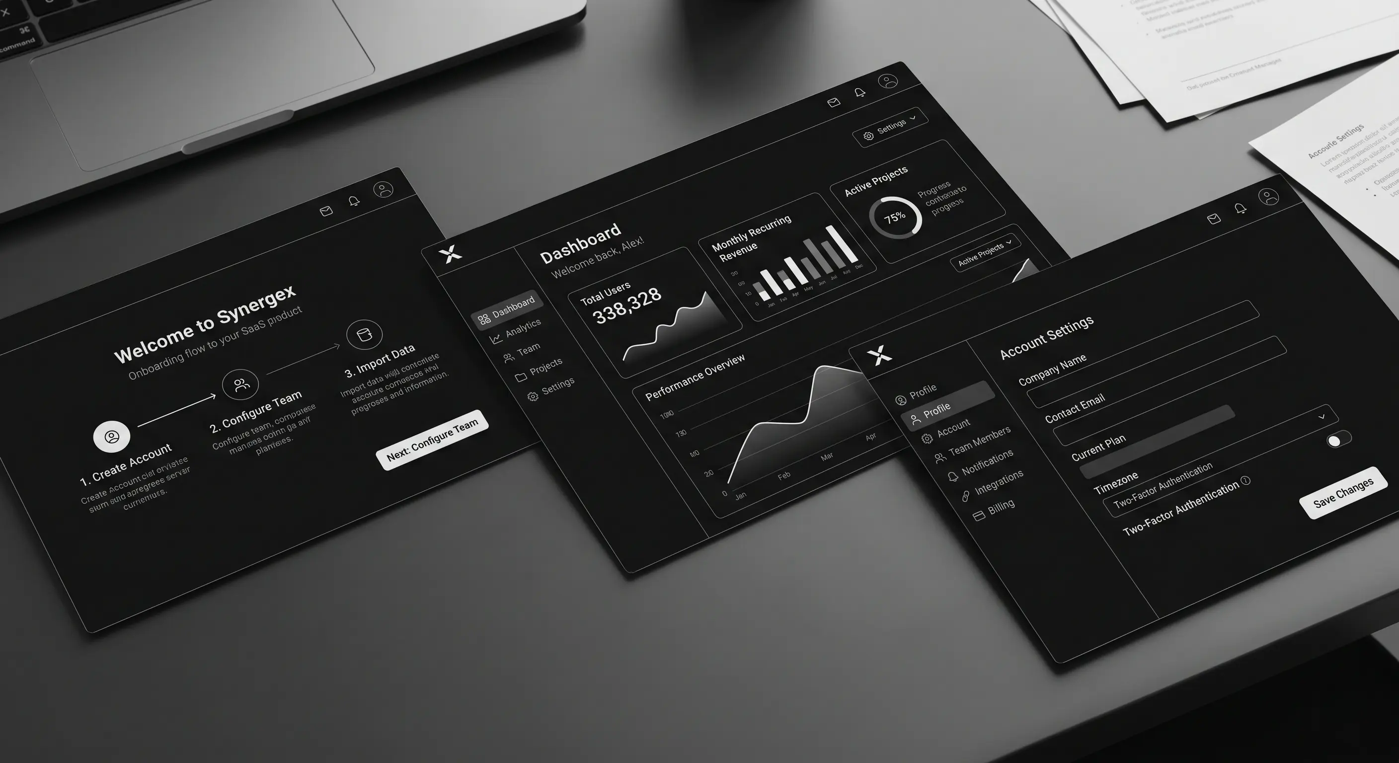
SaaS UX is the design of every touchpoint where a user meets your product — from landing page through signup, onboarding, core workflows, settings, billing, and offboarding. Good SaaS UX has three observable outcomes:
Time-to-first-value shrinks. The user hits the "aha" in minutes, not sessions.
Activation rate rises. More trials convert. More free plans upgrade.
Support tickets drop. Clear UX is cheaper support.
Design polish is table stakes in 2026. The differentiator is how quickly your product reveals its value and how little friction sits between the user and the job they hired you for.
Why SaaS UX Matters More in 2026
1. PLG is the default motion. Even enterprise-led SaaS now runs product-led trials and self-serve signup. The product has to sell itself inside the first session, not after a CSM call.2. Buyers evaluate faster. The average B2B buyer evaluates 4–6 tools before choosing one. Your product has maybe 15 minutes to prove value. Bad onboarding and you're cut from the shortlist.3. Retention is the only growth left. CAC is up, budgets are tight, and expansion revenue is where healthy SaaS companies grow in 2026. UX is the retention and expansion engine — not marketing.
How Good SaaS UX Works (The 8 Principles That Drive Numbers)
1. Clarity over cleverness
Every screen answers "what is this, why am I here, what do I do next" in under three seconds. Clever copy and ambiguous icons cost conversion. Name buttons literally. Label sections with the user's language, not yours.
2. Time-to-value is a design metric
Measure how long it takes a new signup to complete the action that correlates with retention. Design every flow to shrink that number. Pre-fill. Skip steps. Offer sample data. Remove setup that can wait.
3. Progressive disclosure
Show only what the user needs right now. Advanced settings, integrations, and power features stay collapsed until the user reaches for them. Overwhelm kills activation.
4. Contextual help, not documentation dumps
Inline hints at the point of action beat a linked knowledge base. If users are clicking "Help" frequently, the UX is broken — not the docs.
5. Trust-building at every friction point
Pricing pages, upgrade prompts, and data-entry forms are trust moments. Social proof, security badges, money-back reminders, and plain-language microcopy reduce drop-off at these points more than any redesign.
6. Performance is UX
Every second of load time costs conversion. SaaS dashboards with 3+ second interactions lose active users. Instrument Time-to-Interactive (TTI) and Interaction-to-Next-Paint (INP) on your core workflows.
7. Lifecycle-aware design
New users need a different product than power users. Default to sensible "new user" state, graduate to advanced as usage matures. Paywalls, upgrade prompts, and expansion CTAs trigger on behaviour, not calendar.
8. Cross-platform consistency
Marketing site, signup, product, email, mobile, and support channels need a shared design system. Visual and behavioural consistency is a trust signal. Our UI/UX design teamtreats this as a single system, not three disciplines.
Step-by-Step: Auditing Your Current SaaS UX
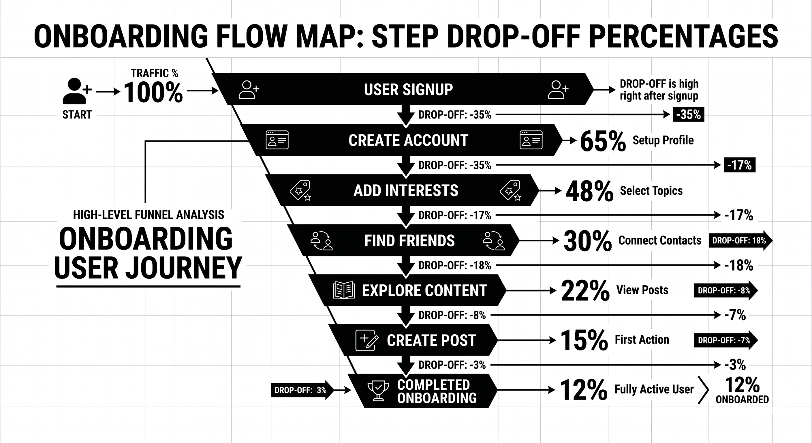
Step 1 — Run a time-to-value test. Watch 10 new users sign up, without intervention, and time how long it takes each to reach your core "aha" moment. The gap between your best and worst case is your opportunity.Step 2 — Session replay review. Pull 20 sessions from new signups. Tag every moment of confusion, rage click, or abandonment. Cluster by root cause.Step 3 — Support ticket audit. Top 10 recurring tickets over the last 60 days. Every one of them represents a UX failure, not a user problem.Step 4 — Funnel instrumentation. Signup → activation → retention → expansion. Each stage broken into micro-steps with drop-off measured. You cannot fix what you cannot see.Step 5 — Prioritised redesign backlog. Everything above becomes a scored backlog. Fix the biggest drop-off first. Ship small, measure, iterate.
Your product UX is probably costing you 15–30% of activation you could capture. Our product design team runs free 45-minute SaaS UX audits — we'll walk your onboarding and show you the three biggest leaks specific to your product. Book a UX audit.
Best Tools for SaaS UX in 2026
Figma — Still the design tool. Variables, auto layout, and dev mode are non-negotiable in 2026.
Fullstory, Hotjar, or Microsoft Clarity — Session replay. Clarity is free and good.
Amplitude or Mixpanel — Funnel analytics, retention curves, feature adoption.
Userpilot, Appcues, or Chameleon — In-product onboarding and contextual hints.
Sprig or Dovetail — Qualitative research and in-product surveys.
Storybook — Component library for engineering-design sync.
Maze or UserTesting — Remote usability testing at scale.
Linear + Notion — Design-to-engineering handoff and research documentation.
If you're running a B2B website alongside the product, pair these with our B2B UX design guidefor the marketing side.
Common SaaS UX Mistakes
1. Redesigning for the team, not the user. Leadership wants a "fresh look." Designers ship a refresh that doesn't change the numbers. Fix: anchor every redesign to a measurable outcome (activation, retention, expansion).2. Empty states that aren't empty states. New users land in a blank dashboard with no direction. Fix: sample data, guided first action, celebratory moment at completion.3. Feature dumping in onboarding. 8-step product tour nobody finishes. Fix: one action, one value moment. Rest of the product reveals itself contextually.4. Dark patterns at upgrade. Hiding cancel buttons, forced account call-to-cancel. Short-term retention lift, long-term reputation damage. Don't.5. Marketing site and product feel like two different companies. Buyer converts on a polished marketing site, signs up, and meets a 2019 dashboard. Fix: unified design system across marketing and product.6. No instrumentation. Design ships, nobody measures what happened. Fix: every major UX change gets a measurement plan before launch.
FAQ
What's the difference between UI and UX in SaaS?
UI is the visual interface — typography, spacing, colour, components. UX is the broader system — flows, friction, time-to-value, retention behaviour. UI is a subset of UX. Great UI with broken UX still loses.
How much does SaaS UI/UX design cost?
Retainer with a specialist product design agency: £8–25k/month. Single project redesign: £25–100k depending on scope. In-house senior product designer: £80–140k/year fully loaded.
How do I measure if UX improvements are working?
Three metrics: activation rate (did new signups complete the key action), time-to-value (how long did it take), and 30-day retention. Design changes that don't move these are cosmetic.
Should I use a design system?
Yes, past about 20 components. Design systems save 40–60% of future design and engineering time. Tailwind, shadcn/ui, or a custom token-driven system are standard starting points in 2026.
How often should SaaS UX be updated?
Continuous, not cyclical. Major redesigns every 3–4 years. Component-level and flow-level updates shipping monthly in a healthy product.
Do I need a specialist SaaS UX agency?
For PLG SaaS, yes — generalist agencies rarely understand activation, expansion, and lifecycle-driven design. Our team works exclusively with SaaS and B2B clients, so the patterns and pitfalls are familiar.
Conclusion: UX as the Quiet Growth Lever
UX doesn't make headlines like a new product launch or a viral campaign, but it's the lever that quietly determines whether your growth model compounds or leaks. The SaaS companies growing healthily in 2026 have made product design a first-class revenue function, not a polish phase at the end of engineering.If your activation, retention, or expansion numbers are softer than they should be, the answer is rarely another feature. It's clearer flows, faster time-to-value, and design that respects what the user came to do.Our product design team works with SaaS companies in the UK and USA to diagnose and fix UX leaks that cost real revenue. Book a free UX audit — 45 minutes, and we'll show you exactly where your product is leaking users.
The SaaS Onboarding UX Audit Template — the Notion template we use on every client audit to map funnel drop-off, friction points, and prioritised fixes.

.svg)





.png)
.svg)
.svg)

.svg)


.svg)
.svg)
.svg)
.svg)
.svg)
.svg)



.svg)